

The all-in-one travel planning platform - say goodbye to the rest
Launch Project
UX
UI
Interaction Design
UX Research
Branding
Application Design
Roles
UX Designer
UI Designer
Interaction Designer
Visual Designer
UX Researcher
Duration
4 Weeks
Tools
Figma
Optimal Workshop
Maze
Team
2024 Q1 Capstone
Agenda
001 Project Overview
002 Research
003 Creating Structure
004 Feature Roadmap
005 Visual Design
006 Understanding the User Experience
007 Early Wireframes
008 Usability Testing
009 Hi-Fi Wireframes
010 Future Steps
011 Lessons Learned
Getting Closer to User-Centered Design

Wanderlog
Pros: Brand recognition, loads of features, can plan and budget.
Cons: Important features behind paywall, feature overload

Tripsy
Pros: Allows users to easily plan a trip with 3rd party integrations
Cons: Complicated interface that allows for many easy errors.

TripIt
Pros: Simple interface and allows for planning and budgeting
Cons: Too simple, no notifications, can't work offline
Research
Overview
My research first centered around the competition landscape. By capitalizing on competitors' weaknesses and acknowledging their strengths, Embark can find its unique competitive advantage. Over 5 user interviews were conducted that helped understand their unique pain points and what they’re hoping to resolve.
Findings
• Lots of competition in the space however they are either trying to do it all or are hyper-specialized
• Takes an average of 10 hours to plan and budget a trip and expressed frustration with the situation
• Concerns ran the gamut: from a simple lack of time to not sure where to start leading to half planning a trip
Project Overview
The Story
• More and more people are traveling since the end of the pandemic, with 26% of Americans visiting more than 5 countries a year. This is an increase of 10% from 2019. Given that, the avid traveler spends at least 25 hours a year planning a trip - time that could be used finding better flights, tours, and more.
• Making matters worse, because they are using non travel specific platforms like Excel or Google Sheets or just relying on email confirmations to plan/manage their trip, travelers will sometimes miss a reservation, get help up at the airport, and even have a negative experience making them ask “was this trip worth it?”
The Problems
• Excess time being spent planning and managing a trip that could be used more wisely
• Missing activities while on the trip due to using non travel specific software
• Accidentally double booking activities leading to money wasted
The Solution
The ideal solution is to have a true all-in-one travel management website that will allow the customer to plan and budget in one place to eliminate needing to use multiple apps.
Defining key motivations through user personas
Superficially it might seem that everyone is interested in the same thing: Saving time… but upon closer inspection, user research made it clear that there were divergent motivations.
Creating personas helped bring clarity to those divergences, which became important reference points as functions developed.
As I continued to conduct research and proceeded with design, I focused primarily on one persona because they represented the power user and a heavy emphasis of key functions: planning and budgeting within one platform to reduce fatigue; and reliance on a platform that provides reminders for upcoming activities.


I'm frustrated with how many apps I need to use just to plan a single trip
"
"
"
I've missed activities and reservations because I didn't have reminders
It takes me so much time to plan a single trip. Sometimes I debate if it's worth the effort

Heighten user empathy by exploring common tasks
By creating and exploring journey maps of the main persona and their typical tasks, I uncovered key emotional/procedural moments that Embark needed to address. The stress someone might feel, for example, if they are planning a longer trip and are using multiple platforms. Or the sadness they’d feel if they missed an important dinner reservation due to lack of planning or no notification. To ensure Embark’s stickiness, it would need to conquer some of these problems…and not introduce new points of friction.


Creating Structure
The site map, which is backed by research and user interviews, depicts the three key task streams that the hi-fi prototype will focus on: 1. Onboarding and account creation, 2. Creating their first trip, and 3. Adding an item and editing their itinerary. The framework the site map provides, along with the research collected so far, guided the decisions moving forward.
Feature Roadmap
Must-Have Features
Based on my competitive analysis and talking with potential users, the main features and functionality Embark needs to include are:
• Creating a trip
• Building and editing an itinerary
• Creating and managing a budget
• Adding expenses
Establishing Visual Design
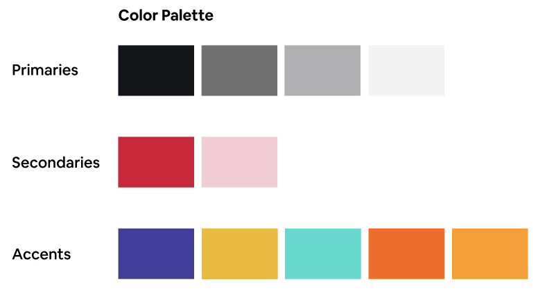
Visually articulating all the potential aspects of the Embark brand meant defining a baseline design system that identified key elements of its visual vocabulary. The goal was to make Embark’s visual design refer back to its core mission: Empowering avid travelers to do more with less.
Predominantly red and black palettes imbued screens with a sense of passion and wonder; simple button states and clear iconography help make tasks feel manageable; and a single, modern sans-serif font ensured legibility and clarity in messaging.
Understanding the UX
Visualizing a User-Centric Experience
Quick sketching using the 8x8 method allows me to explore design patterns common among apps in the competitive landscape, helping me understand what needs to transfer over into Embark to ensure familiarity. This also helped me identify screen types that could serve multiple functions, as well as swiping/touch gestures that would likely be the most intuitive.
Early Wireframes
Gearing Up for User Testing
After sketching, low-fi prototypes were created to understand what’s going resonate and empower users. This step allowed me to garner valuable user feedback, initiate the design direction is correct, and make sure time is well spent. This ensured the final design would be more polished and user-centric.
Usability Testing
Surfacing New Issues
The high-fidelity prototype brought test users closest to the real experience yet, and it revealed some key issues that needed to be addressed. While some users were able to complete the onboarding/registration experience, UX heuristics needed to be improved. Account creation needed to be first screen, no avatar selection during registration (reduce friction), and what happens if they don’t have a third party account (Google, Facebook, Apple, etc…) to create an Embark account. Other issues included unclear button placement when creating a trip, sizing of key elements, and lack of back buttons. These were among the topics raised by test subjects.
Testers were also able to verbalize a need they haven’t thought about before this iteration: Could the app somehow book trips natively vs going to a site like TripAdvisor - yet another piece of information that could empower users to reduce the number of platforms to plan a trip.
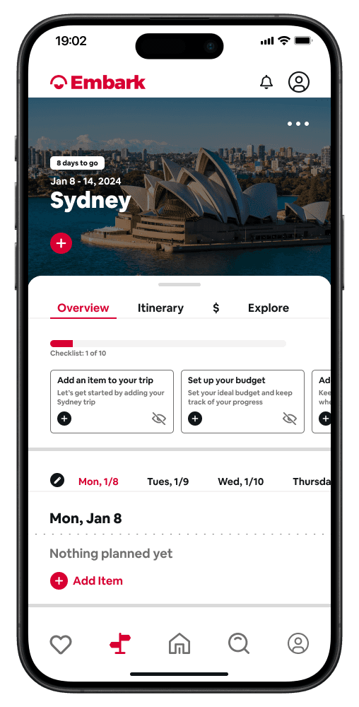
High-Fi Wireframes
The Final Product
The hi-fi prototype includes revisions from user testing and personal changes that I feel make this interface a beautiful and intuitive product.
The high-fi prototype includes all revisions based on user testing that make Embark a usable and desirable travel planning platform for all travelers.
View Prototype
Future Steps
Issues to Address for Long-Term Development
• Booking activities, fights, and hotels, all within Embark
• Sharing trips with friends and family, allowing trip editing across multiple users
• AI algorithms to suggest activities and trips based on past trips and pre-set preferences
Lessons Learned
Key Takeaways
• I went into this project assuming this site would only provide a single function: to plan and manage upcoming trips. I learned very quickly, however, that users needed more features to make it worth consolidating apps that have robust, specific functionality.
• My original intent for the site was to create upcoming trips and manage current trips. While testing with users, I found out users expressed a desire to be able to see where in the world they could go/afford before planning a trip i.e conversion rates, visa requirements, and crime rates. If the issue was budget, Embark would be able to provide a list of recommended places based on pre-set filters and take action.
• People travel in different ways - to have once-in-a-lifetime experiences, get away from work and relax, etc.. and having filtering and search functionality is critical to support different user types.
Let's create something together!
Hit me up!