
The only app needed to launch your restaurant from conception to your grand opening
Launch Project

UX
UI
Interaction Design
UX Research
Branding
Application Design
Roles
UX Designer
UI Designer
Interaction Designer
Visual Designer
UX Researcher
Duration
4 Weeks
Tools
Figma
Optimal Workshop
Maze
Team
2024 Q1 Capstone
Agenda
001 Project Overview
002 Research
003 Creating Structure
004 Feature Roadmap
005 Visual Design
006 Understanding the User Experience
007 Early Wireframes
008 Usability Testing
009 Hi-Fi Wireframes
010 Future Steps
011 Lessons Learned
Getting Closer to User-Centered Design

Notion
Pros: Brand recognition, free to use and can be shared
Cons: Not specific to restaurants and mobile app is limited

Todoist
Pros: Efficient task management
with an intuitive UI
Cons: Lack of advanced features and not restaurant specific

TickTick
Pros: Free to use, lots of features, and easy to navigate
Cons: Only built for small reminders like grocery lists
Research
Overview
My research first centered around the competition landscape. By capitalizing on competitors' weaknesses and acknowledging their strengths, Sizzle can find its unique competitive advantage. Over 5 user interviews were conducted that helped understand their unique pain points and what they’re hoping to resolve.
Findings
• No product exists that fully competed with Sizzle
• Most products that do exist are point solutions that only solve a single issue rather than the entire problem
Project Overview
The Story
The process of opening a new restaurant requires a checklist longer than Santa’s naughty list, but that doesn’t stop restaurateurs from pursuing their dream. However there is a lack of guidance on where to start, what to accomplish next, and if they’re on the right track. There is no all-in-one solution today that new owners can use to track everything. That’s where this solution comes in. The idea to is create an app that helps guide and facilitate the entire process as if they had a consultant working side-by-side.
The Problems
• Over 50,000+ new restaurants open a year, yet 80% of those fail in the first 5 years with 60% failing in the first year
• Restaurants take around 6 months to open with most owners running out of savings halfway through
• 63% new owners have a food industry background yet only a fraction have any business experience
The Solution
The ideal solution is to have one app to help new restaurant owners facilitate the entire process of opening a restaurant to increase success rates, decrease time to open, and fill in knowledge gaps.
Defining key motivations through user personas
Superficially it might seem that everyone is interested in the same thing: Saving time… but upon closer inspection, user research made it clear that there were divergent motivations.
Creating personas helped bring clarity to those divergences, which became important reference points as functions developed.
As I continued to conduct research and proceeded with design, I focused primarily on one persona because they represented the power user and a heavy emphasis of key functions: filling in knowledge gaps, facilitating the process of funding and permits, and the need to only use one platform.


I'm frustrated with not knowing what to do next and get discouraged
"
"
"
I've missed applying for permits and funding on time due to no reminders
It's taken me way longer to open that I've almost depleted my savings
Heighten user empathy by exploring common tasks
By creating and exploring journey maps of the main persona and their typical tasks, I uncovered key emotional/procedural moments that Sizzle needed to address. The stress someone might feel, for example, if they miss deadlines and delay the opening. Or the sadness and anger they'd feel if their restaurant fails in the first year as a direct result of the opening process. To ensure Sizzle's success and stickiness, it would need to conquer some of these problems…and not to introduce new points of friction.
Creating Structure
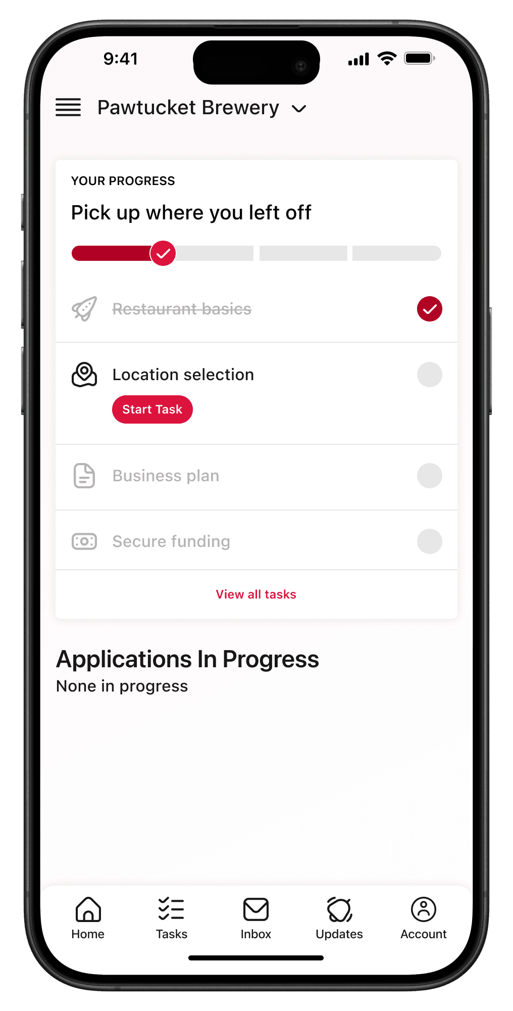
The site map, which is backed by research and user interviews, depicts the three key task streams that the hi-fi prototype will focus on: 1. Selecting their restaurant location using real data from sites like Zillow, 2. Building their business plan, and 3. Securing funding from local or national banks. The framework the site map provides, along with the research collected so far, guided the decisions moving forward.
Feature Roadmap
Must-Have Features
Based on my competitive analysis and talking with potential users, the main features and functionality Sizzle needs to include are:
• Selecting and purchasing a restaurant location
• Building and editing a business plan (with AI)
• Securing funding
Establishing Visual Design
Visually articulating all the potential aspects of the Sizzle brand meant defining a baseline design system that identified key elements of its visual vocabulary. The goal was to make Sizzle's visual design refer back to its core mission: Empowering restaurant owners to open their new restaurant successfully.
Predominantly red and black palettes imbued screens with a sense of passion and excitement; simple button states and clear iconography help make tasks feel manageable; and a single, modern sans-serif font ensured legibility and clarity in messaging.

Understanding the UX
Visualizing a User-Centric Experience
Quick sketching using the 8x8 method allows me to explore design patterns common among apps in the competitive landscape, helping me understand what needs to transfer over into Sizzle to ensure familiarity. This also helped me identify screen types that could serve multiple functions, as well as swiping/touch gestures that would likely be the most intuitive.
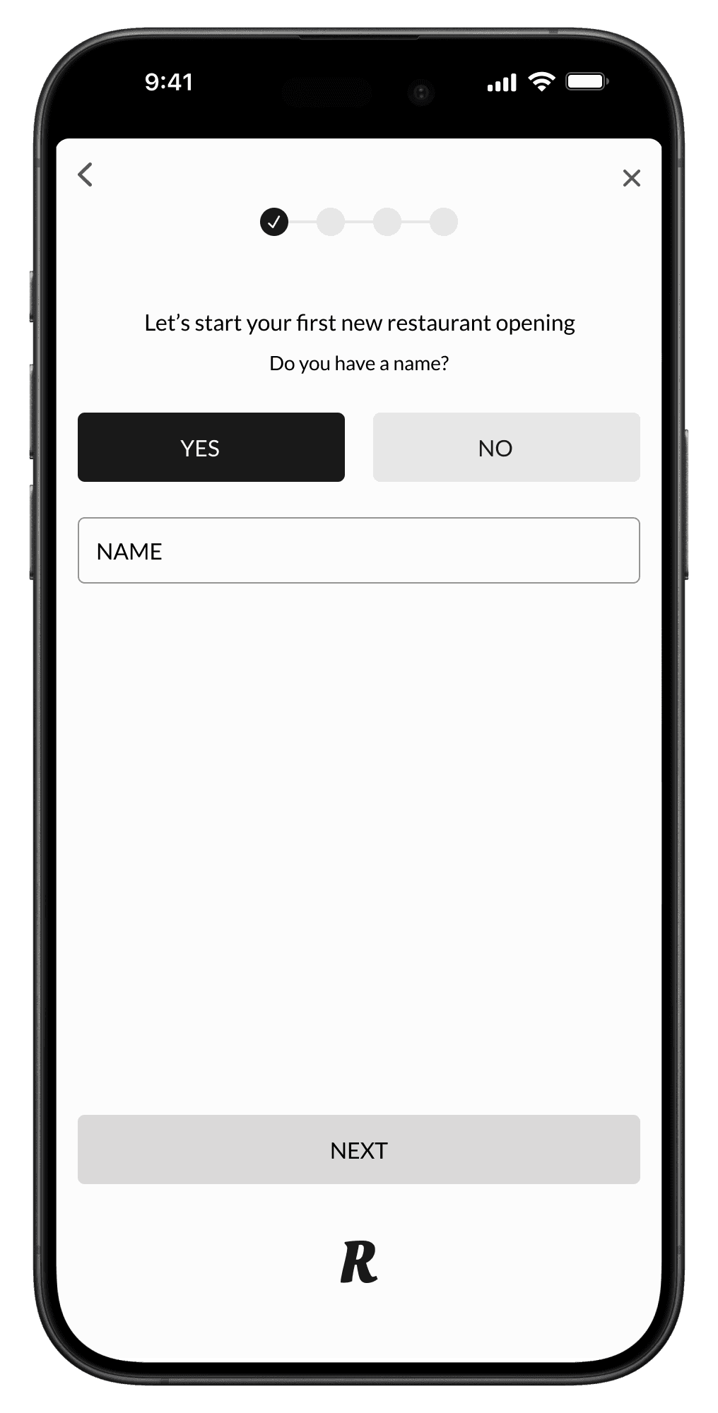
Early Wireframes
Gearing Up for User Testing
After sketching, low-fi prototypes were created to understand what’s going resonate and empower users. This step allowed me to garner valuable user feedback, initiate the design direction is correct, and make sure time is well spent. This ensured the final design would be more polished and user-centric.


Usability Testing
Surfacing New Issues
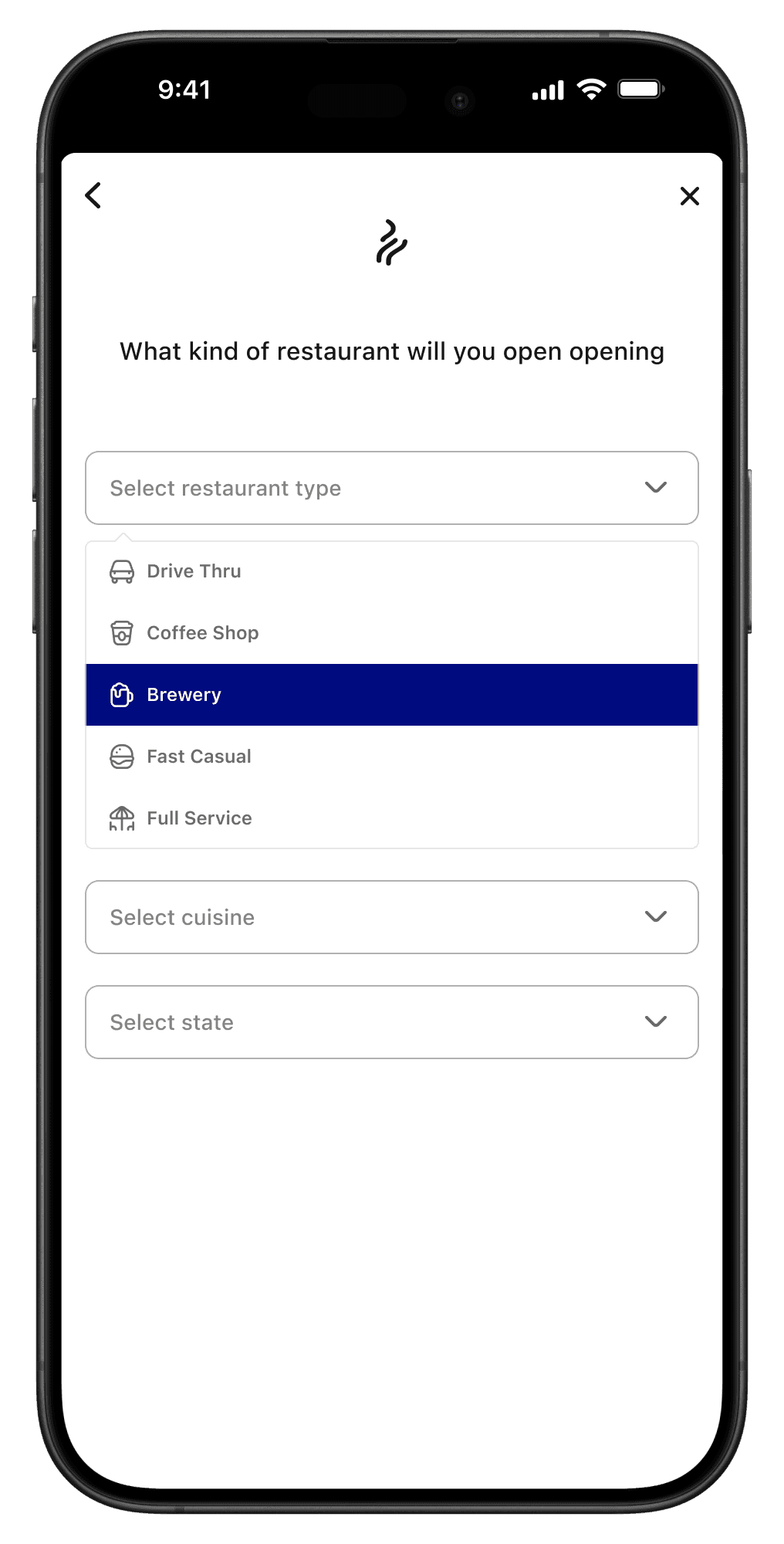
The high-fidelity prototype brought test users closest to the real experience yet, and it revealed some key issues that needed to be addressed. While some users were able to complete the flows, UX heuristics needed to be improved. Adding progress bars to help users understand their place and simplified colors and icons.
Other issues included unclear button placement when selecting a restaurant location and confusion language when developing a business plan.
Testers were also able to verbalize a need they haven’t thought about before this iteration: Could the app also allow me to apply for permits and licenses directly rather than managing that separately through local government websites.
High-Fi Wireframes
The Final Product
The hi-fi prototype includes revisions from user testing and personal changes that I feel makes this interface a beautiful and intuitive product.
The prototype includes all revisions based on user testing that make Sizzle a usable and desirable restaurant opening platform for all new restauranteurs.
View Prototype


Future Steps
Issues to Address for Long-Term Development
• Users will be able to apply, track, and manage permits and licenses directly through Sizzle
• Sizzle will allow users to seek legal help
• Users can design and brand their restaurant and build their menu directly through Sizzle
Lessons Learned
Key Takeaways
• I went into this project assuming that Sizzle would only provide new restaurant owners with a guide for a few key steps in the opening process. I learned quickly however how "sticky" and content heavy this app will become - from restaurant conception to grand opening.
• My original intent for Sizzle was to be a guide or a reference point for new restaurant owners to use, but the would need to go external to complete steps like financing, permits, and marketing. However, through user testing, owners found that Sizzle would be more useful through integrations and features that allowed them to stay within Sizzle through the whole process.
Let's create something together!
Hit me up!